Our Post Launch Assessment Review clocked in at a whopping 52 pages even with the majority of the appendices housed in the Google Drive. I am sure that we will post some sections of it on the blog over the next few weeks but I wanted to share our data with you because I've had a few people ask me about our results.
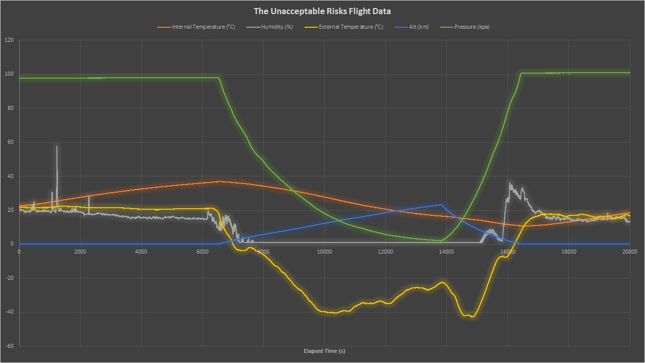
The orange line in the graph above shows our internal temperature, which will be discussed more in depth in the next graph. This shows the temperature steadily rising until our launch point, indicated by where the altitude, the blue line, starts to increase. It plummeted during the flight until the payload landed and then temperatures leveled out again.
The white line, humidity, spiked multiple times during our filling of the balloon; this was likely caused by a team member breathing on it or perspiring near it. The humidity is very erratic around our launch point due to being introduced to outside air for the first time. It rose very quickly through mostly cloudless skies and therefore we did not see a large increase in humidity as the balloon rose. It then remains at minimal levels throughout the time in the upper atmosphere. There is an increase as it is descending which indicates it passing through the clouds on the way back down to earth. This is corroborated by looking at the photographs from flight. Once the payload landed, it stayed relatively constant.
External temperature shown by the yellow line was one of the more interesting readings of the flight. It shows a steady temperature during the inflation but then a very quick drop as we moved outside and then a steady drop throughout the flight. One particularly interesting point on the graph is that as the humidity at launch is approaching zero the temperature jumped up a couple degrees for a few moments before steadily decreasing. Then, as our research predicted, the temperature decreased as we moved up through the troposphere making it to nearly -20°C. Once it reached the tropopause the temperature increased as it moved higher into the stratosphere until the balloon burst. The temperature then decreased as the payload fell back to the tropopause and then began to increase as it made its way down to earth’s surface. We reached our lowest temperature during our fall, showing the differences in temperature at similar altitudes but different locations.
The green line indicating pressure is the most expected line on our graph. It decreases steadily throughout the flight reaching its minimum right at our burst altitude, nearly reaching zero. Then after burst it increased at a steady rate until it arrived at our landing site back at near sea level.

This is the graph of our internal temperature measured from our BMP183 sensor. It was very unexpected for the temperature to spike like that in the beginning. This was due to our electronics generating heat and our excellent insulation. We believe this build-up of heat before launch caused our GoPro and 2m GPS to fail. While we had done testing to make sure our payload would work in cold temperatures it never occurred to us to check if the internal temperature was below safe operating range. Temperature steadily declined during our flight due to the colder temperatures of the upper atmosphere. However, it never dropped below freezing inside the payload. The internal temperature then steadily increased as our payload sat in a tree until you see the sudden drop when we opened the payload upon retrieval.
No comments:
Post a Comment